DIRECTIONSThree working homepages, one chosen
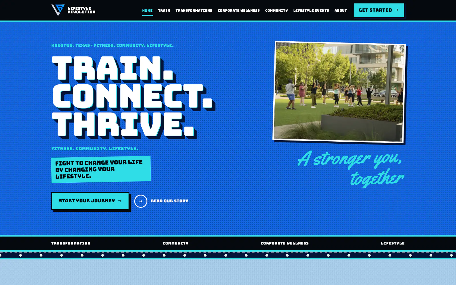
Instead of mockups, the client saw three complete, working homepages running off one shared content file. The Bill: Houston event sign-painting. The Rack: a skate-shop deck wall. The Cut: a two-ink programme bill. The owner picked The Bill and supplied the brand’s colors, and it was repainted in them. All three passed a mobile sweep from 320 to 1440px before the client saw them.
SYSTEMSeven cans, rules enforced in CSS
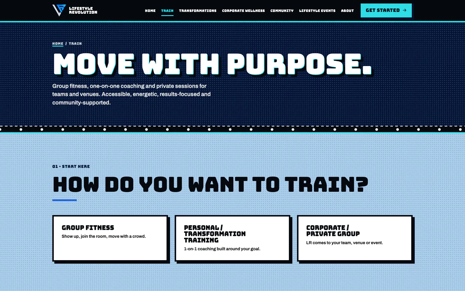
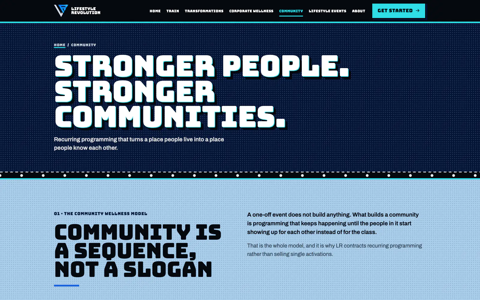
Bungee showcard lettering cut over an aqua keyline and a navy cast shade, flat enamel fields with a halftone tooth, and bands that hang from stitched, punched grommet hems. No blur and no drop shadows, only hard offset blocks. Aqua is the one signal color and only marks state and action. Every text pair is measured: all pass AA, and the two that don’t are kept to display sizes only.
RE-SKINA new surface, zero markup changes
When the full seven-page build landed on the owner’s brief, it was re-skinned into The Bill without moving one line of page structure. The pages speak in classes (.band, .cut, .card), so the stylesheet was rewritten underneath them, with a short block of compatibility aliases in :root so older inline color references kept resolving.
CONTENTOne file is the whole CMS
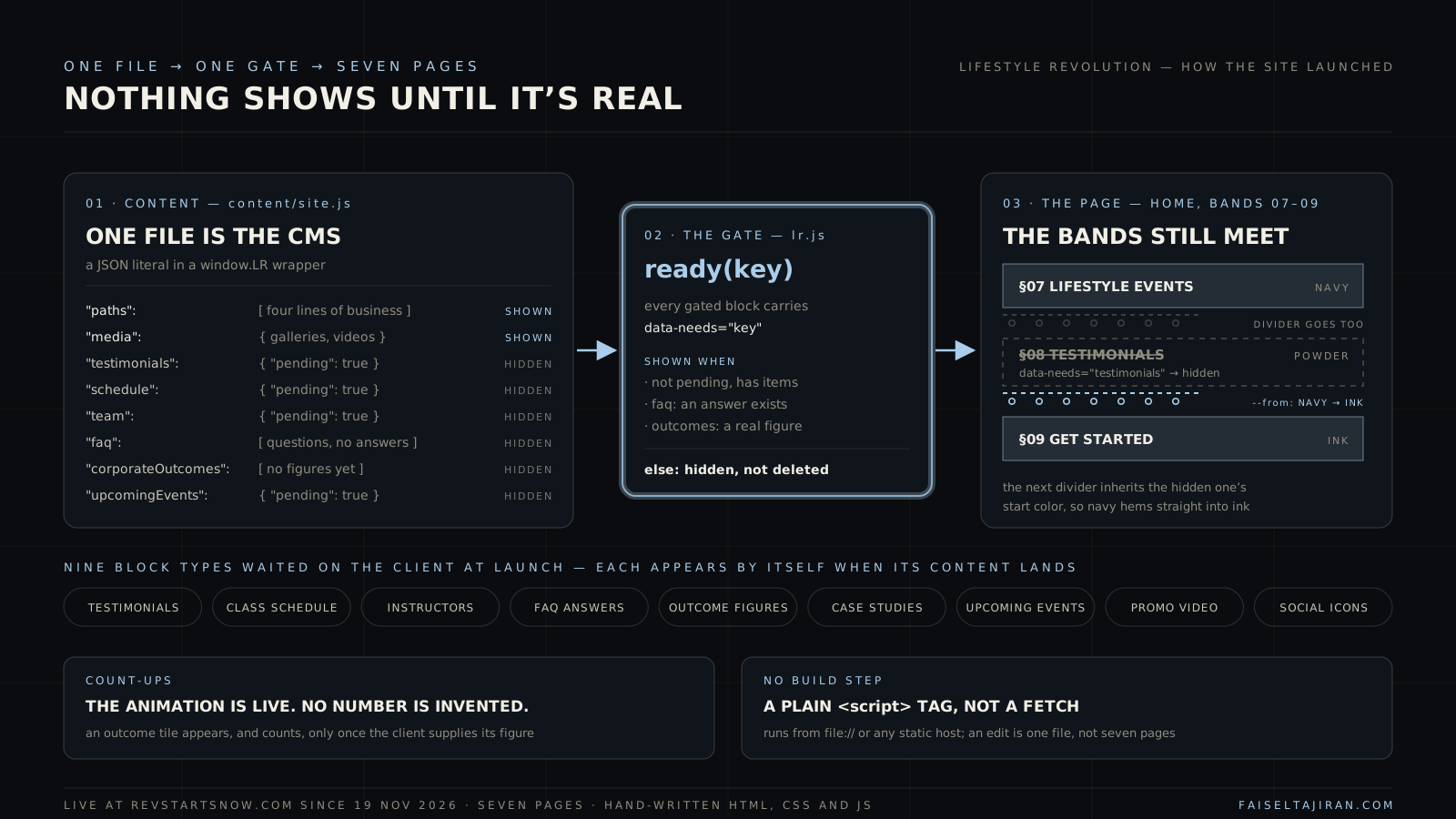
Every word, class, event and photo lives in content/site.js: a JSON literal inside a window.LR wrapper, loaded by a plain script tag. That one choice means no fetch, no build step and no server: the site runs from file:// or any static host, and it is built to plug into the same agent-run change-request pipeline as my other client sites.
LAUNCHHidden, not deleted
Testimonials, the class schedule, instructors, FAQ answers, outcome figures, case studies and upcoming events were all still on their way at launch. Each block carries data-needs="key". A ready() check keeps it hidden until real content lands in the content file, then it appears on its own. A hidden band takes its color divider with it, and the next divider picks up where it left off, so the painted bands still meet cleanly.
MEDIAA repeatable photo and video pipeline
Two batches from the client (51 photos and 3 videos, then a photographer’s session and an event shoot) went through Pillow and ffmpeg. All camera metadata (GPS, device, timestamps) was stripped, orientation applied, Display P3 converted to sRGB, and H.264 encoded with faststart. Files were renamed by subject. The second batch replaced the low-res phone shots wherever it could do the same job.
LOGOA glow on black, lifted to alpha
The logo arrived as a PNG of a glowing monogram painted on black, not a cut-out. The black was lifted into transparency (alpha from brightness, color divided back out), so it sits on the site’s ink fields with no box edge, exactly as it looked on black. It is used only on dark fields, and a vector is on the request list for print.
LAUNCH OPSForms, analytics, SEO, headers
Six Netlify Forms with honeypots, validated client-side, each firing a form_submit_success event into Google Tag Manager so leads can be counted. Keyword-led titles naming Houston, canonicals, share cards, and JSON-LD (HealthAndBeautyBusiness, WebSite, BreadcrumbList). Security headers, a branded 404, and the domain moved from a GoDaddy builder page to Netlify DNS on launch day.